Comerica Bank

Project Summary
In 2022, I collaborated with Comerica Bank to design and launch a modern Treasury Management portal, known as TME (Treasury Management Experience). The goal of this initiative was to streamline and modernize the onboarding process for new enterprise accounts while significantly reducing the time and complexity involved in managing treasury services. This included simplifying tasks such as adding or removing services, updating account details, and overseeing user roles and permissions. By reimagining the portal’s user experience, we aimed to deliver greater efficiency, clarity, and control for enterprise banking customers—ultimately improving operational workflows and client satisfaction.
Agency
Publicis Sapient
Client
Comerica Bank
Project role
Sr. UX research and design lead
Year
2021-22
Discovery Phase
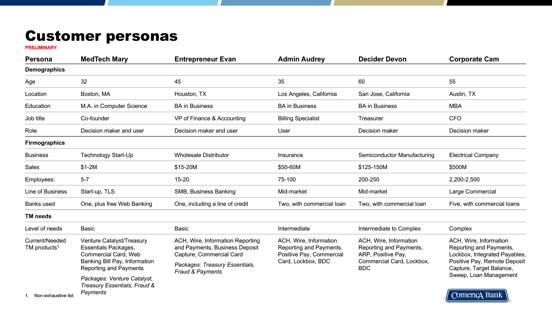
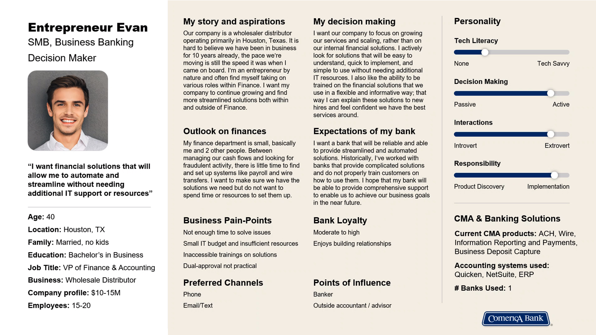
To deliver the right solution, it was essential to deeply understand the user journey and focus on specific customer personas—taking into account their needs, goals, pain points, and varying levels of technical proficiency. By building a clear picture of key demographics, we were able to address common challenges across user types, establish a well-defined hierarchy of tasks and functions, and uncover opportunities for meaningful innovation.
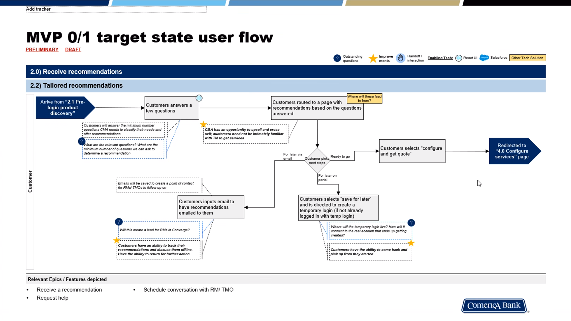
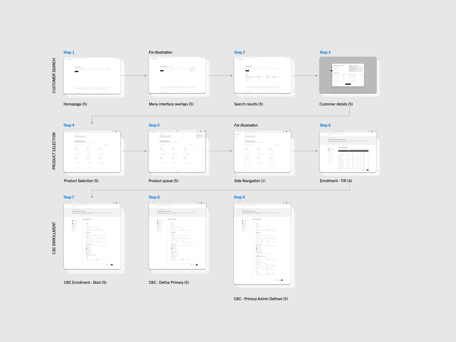
Wire flow diagram
Wire flows are a combination of wireframes and flow diagrams. They visually map out how users navigate through a product, connecting screens with arrows that show user interactions, decision points, and system responses. By visualizing the entire interaction flow, teams can spot missing screens, unnecessary steps, or logic gaps before high-fidelity design or development begins.
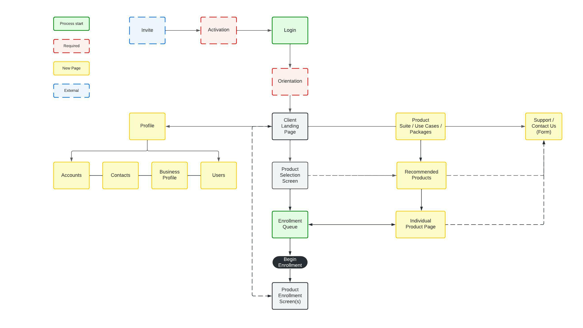
Sitemap and navigation
Sitemapping is a foundational exercise in product design that goes beyond simply listing pages or screens—it’s a strategic tool for visualizing the structure of a product and aligning it with user needs and behaviors. It plays a critical role in shaping a seamless, intuitive user journey.
When I lead a sitemapping exercise, I combine user research insights, content strategy, and business objectives to build a structure that mirrors how users think and behave. It’s not just about organizing screens—it’s about designing pathways that support confident, goal-oriented navigation from start to finish.
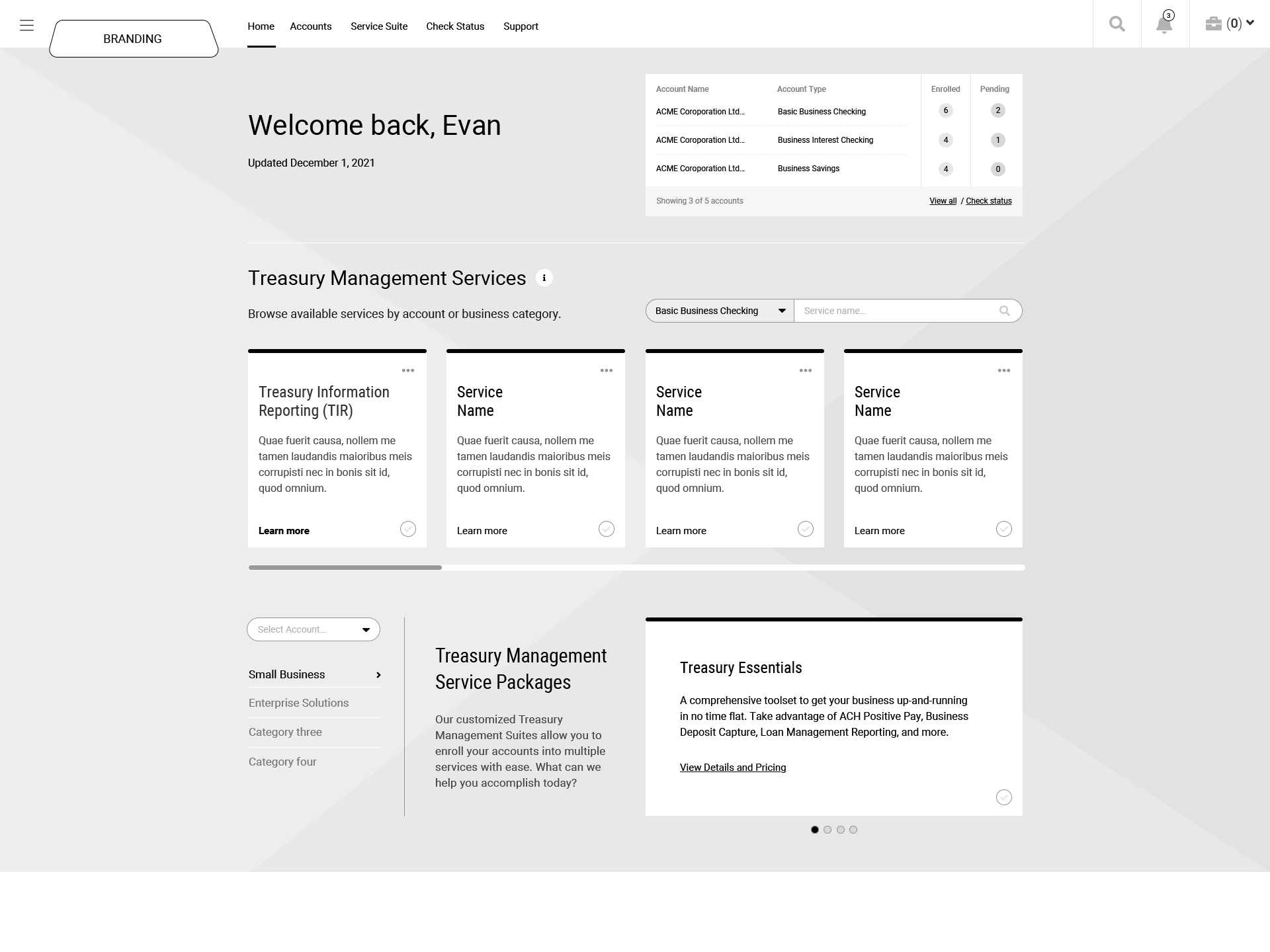
Preliminary wireframes
After completing the discovery phase, gathering and prioritizing project requirements, and establishing a solid sitemap, I developed preliminary wireframes to begin visualizing how the portal could be structured and organized. This step is critical for aligning the design with technical feasibility—ensuring there are no development constraints that could impact the portal’s functionality or user experience.
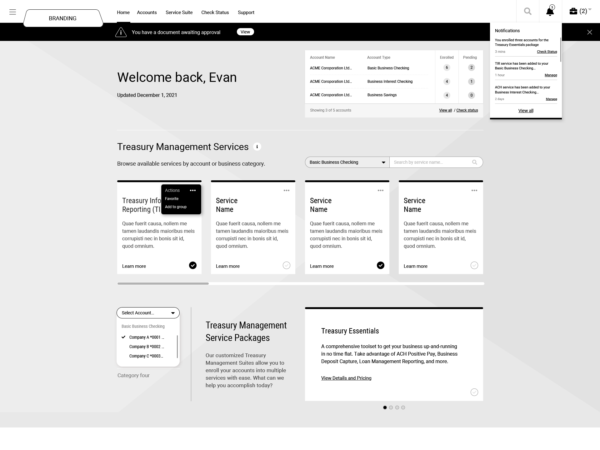
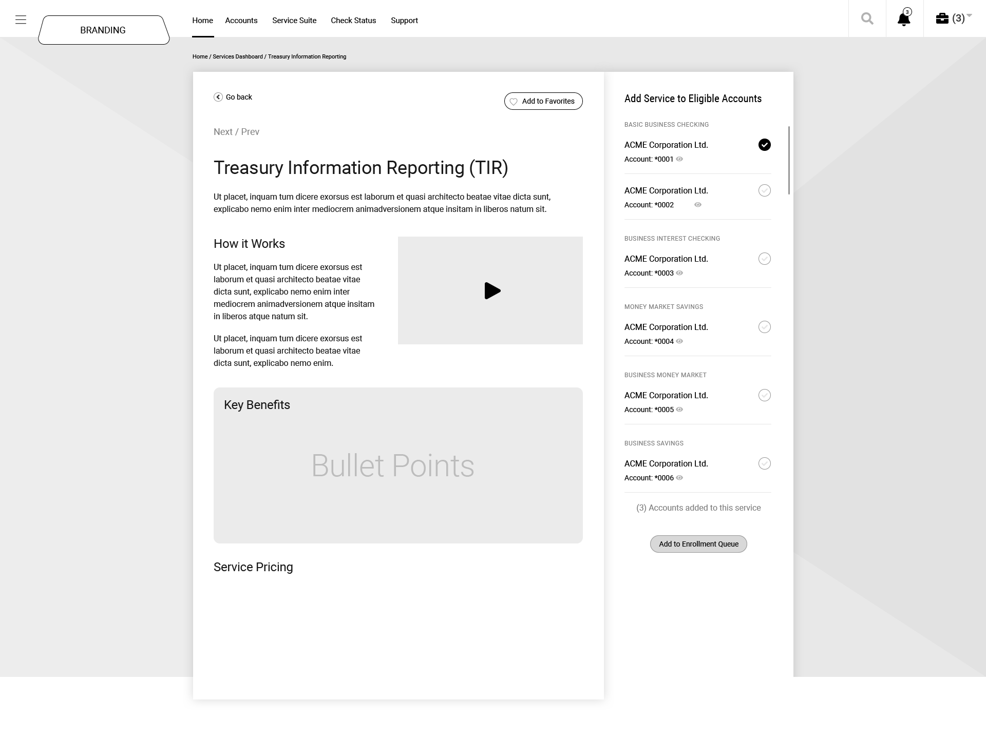
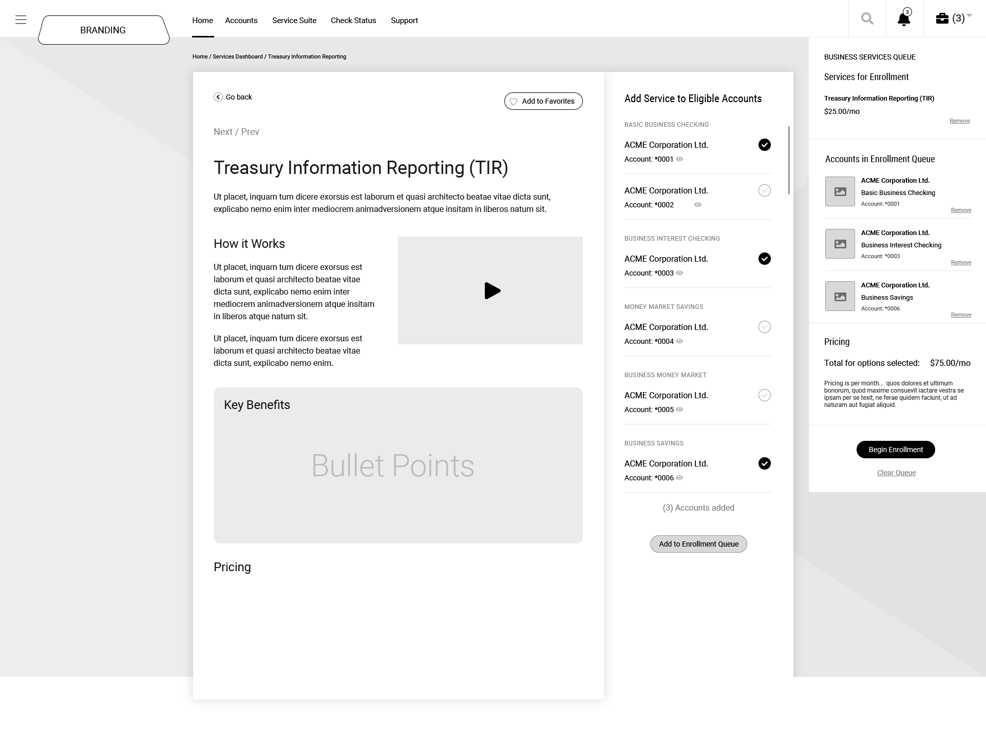

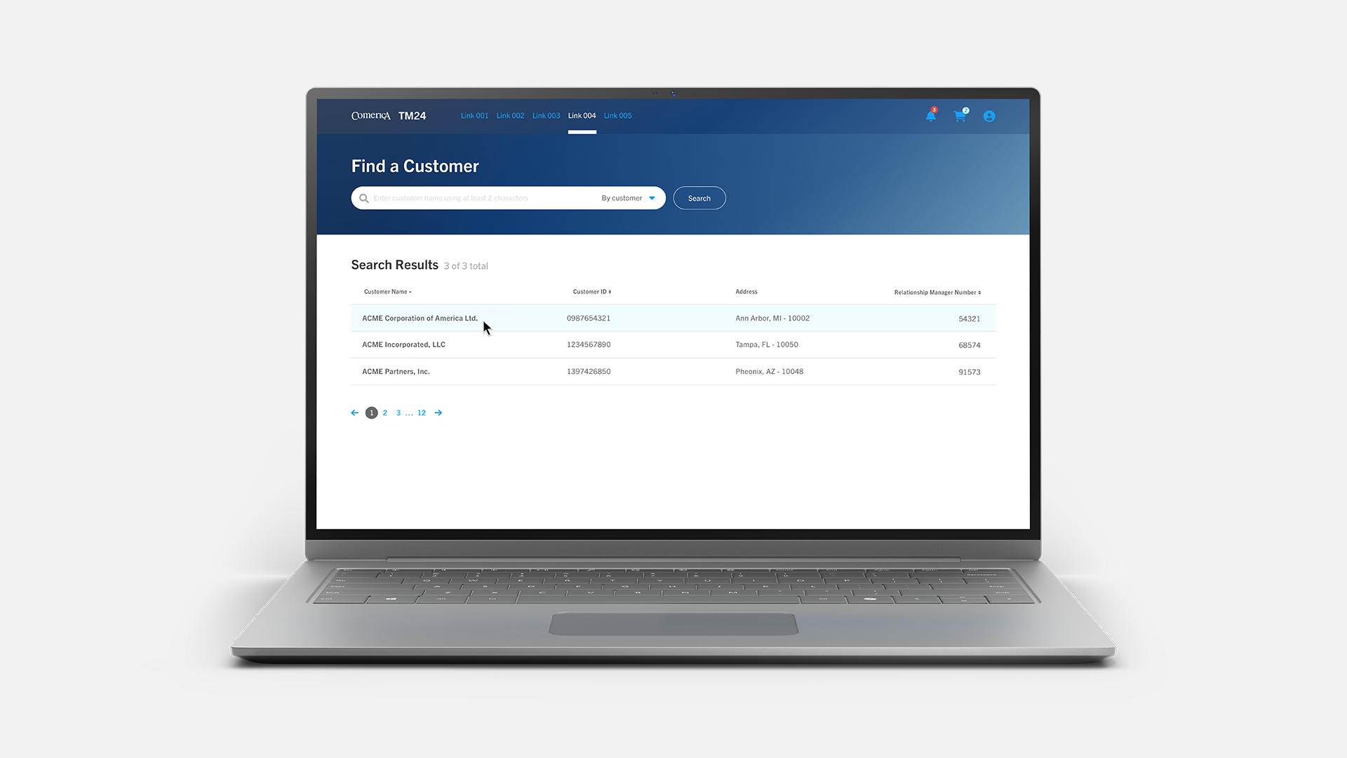
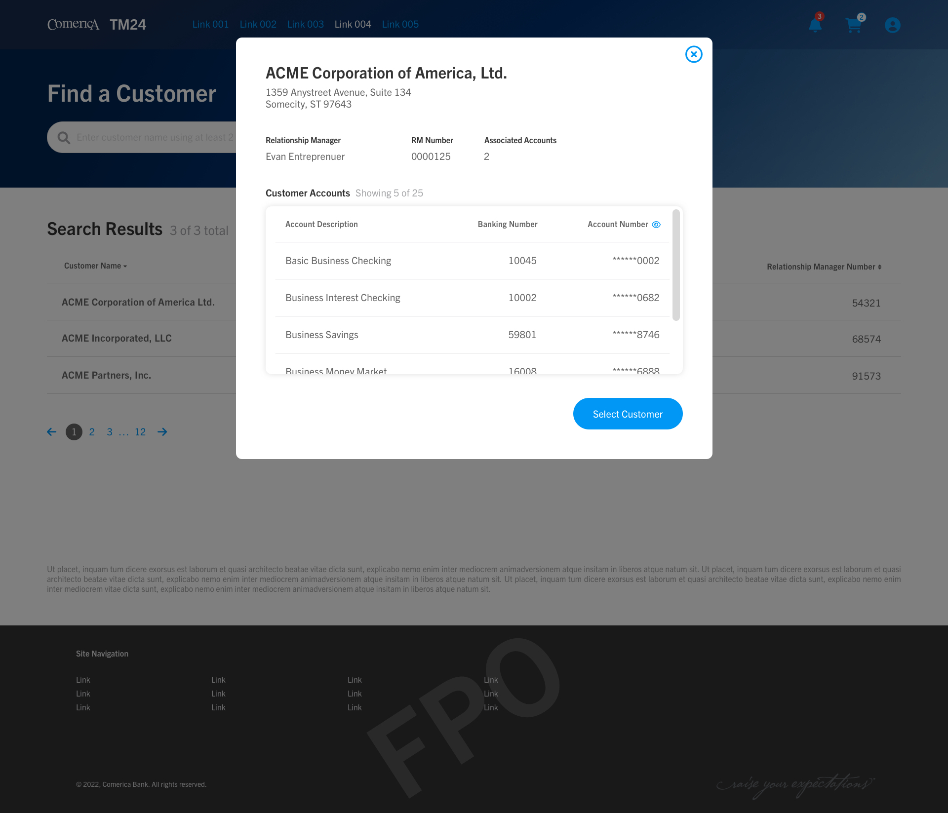
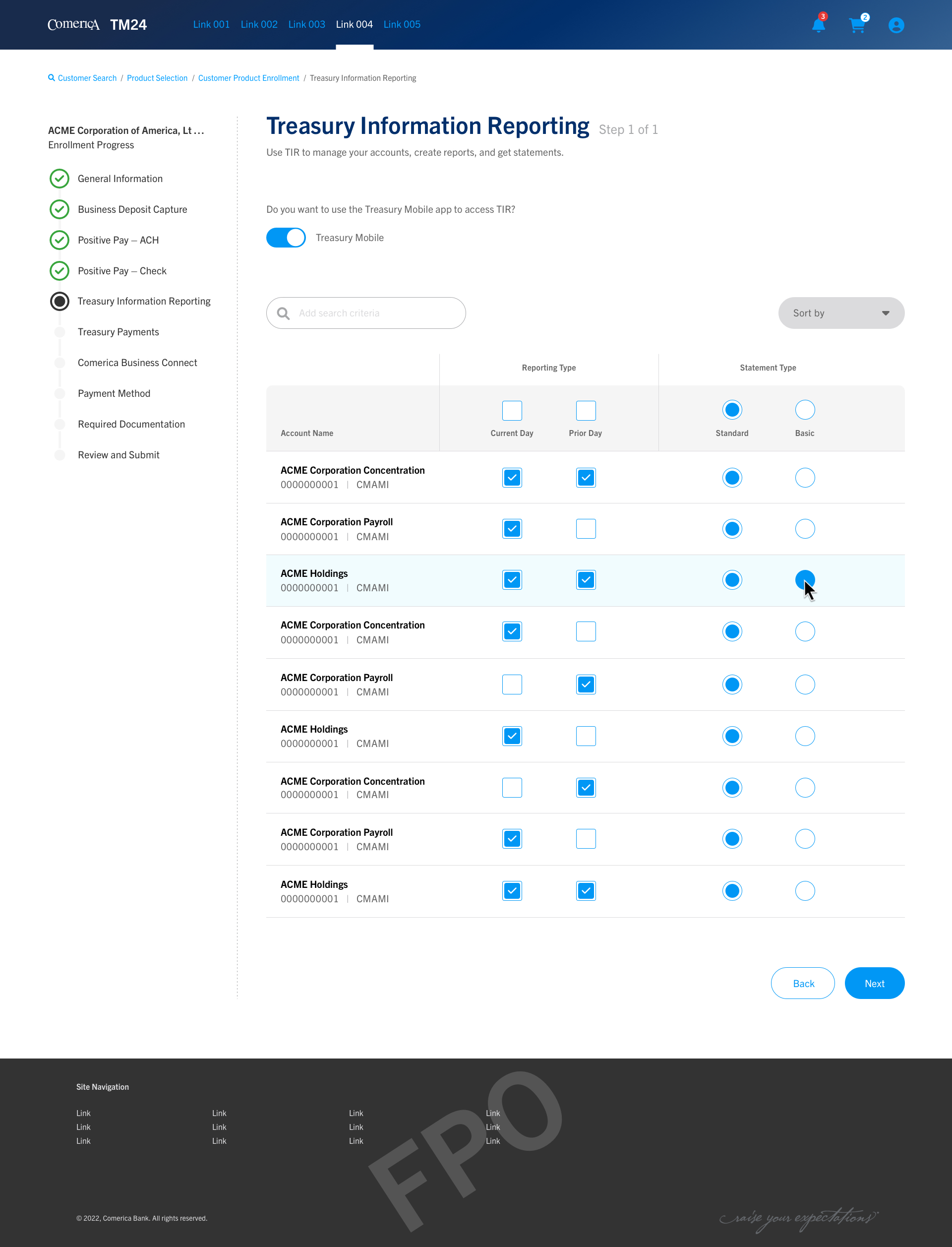
Interface design
In the realm of treasury management and online banking, it’s essential for user interfaces to maintain a clear, consistent design approach that aligns seamlessly with the brand’s voice, look, and feel. This consistency not only reinforces user trust in the system but also makes navigation and interaction more intuitive. Drawing on Jakob’s Law—which states that users prefer systems that operate similarly to those they already use—our goal is to create a portal experience that feels both familiar and effortless. By following established UX best practices, we can strike the right balance between a customized visual identity and a user experience that’s intuitive, efficient, and easy to adopt.